
BUILDING A STORY-DRIVEN BRAND SYSTEM

What makes a vacation rental logo actually work?
I don’t just mean aesthetically—but emotionally.
In the STR world, logos are often treated like the finishing touch. A stamp for the website header. Something polished to place on a welcome guide or coffee mug after the “real” work is done.
But in my years spent executing STR experiential marketing strategies for hosts, the strongest logos are doing much heavier lifting than that.
They carry emotional tone before a guest ever arrives.
They signal who a space is for.
And when done thoughtfully, an STR logo becomes part of a much larger storytelling system that stretches across the guest experience itself.
THAT’S EXACTLY WHAT HAPPENED WITH THE CAMP COLLECTION.
What I love most about this project is that the visual identity wasn’t approached as isolated graphic design work. It was built in conversation with narrative, guest experience, emotional positioning, and place itself.
Before diving into the graphic design work itself, it’s important to understand how The Olive Jar approaches branding at a foundational level.
Because after decades of working with graphic designers and illustrators, no two creatives are the same—but, we can facilitate the most beautiful mind meld when approached with a process built with intentionality.
This wasn’t a handoff. It was a conversation.
As Creative Director on every project, I work closely with our graphic designer.
I’ve been working for years with Emilie from LiefDesign, and I knew she’d be the perfect fit for The Camp Collection to translate its fully developed brand story into a logo family that felt aligned with with the visual identity. Emilie wasn’t starting from scratch—or even from a mood board alone.
Each property we serve enters the design phase with a 30–40 page Brand Story Guide first, built in-house by The Olive Jar.
our brand story guides define everything from emotional positioning and guest archetypes to tone, spatial storytelling, and experiential touch points.

Excerpts taken from The Camp Collection Brand Story Guides. For The Camp Collection, I’ve been working with STR design partner, Moira Sedgwick of A Chalet Collective. It’s important that my entire team is collaboratively involved from day one of such foundational groundwork.

Mood boards (one of many) from The Camp Collection Brand Story Guides
the olive jar brand story guides literally spell out the brand messaging woven throughout the guest journey.
For this project specifically, we’d built two distinct property narratives—Camp Kindred and Camp Ember—both nested within a larger umbrella brand system called The Camp Collection.
From there, Emilie’s process became deeply collaborative:
• We shared full brand strategy documents
• We mapped emotional direction for each property
• We provided inspo references across hospitality, lifestyle, and STR brands that resonated between us and the client—and why
• And together, we refined how those ideas would translate into a cohesive visual identity system.
This wasn’t a handoff. It was a conversation (which continues, too).
The Camp Collection LOGO DEVELOPMENT is a great example of what happens when STR experiential marketing strategy leads design—but design is still given room to interpret, refine, and elevate the story.
And honestly, I think that collaborative tension is where the best branding development takes place.
So for this post, I wanted to hand Emilie the mic, and pull back the curtain on what this process actually looked like from her perspective as the graphic designer and illustrator translating story into form.
5 ESSENTIALS OF BUILDING A BRAND SYSTEM
AN INSIDE LOOK AT THE OLIVE JAR’S COLLABORATIVE PROCESS

1) START WITH NARRATIVE, NOT JUST AESTHETIC
DAWN: When you first received The Camp Collection Brand Story Guides for Camp Kindred and Camp Ember, as well as curated logo inspiration references from both The Olive Jar and the client, what stood out to you most about the narrative direction?
EMILIE: Working from the brand story work was incredible, and I loved hearing from your client’s voice too. It gave me space to just jump right into the design process, rather than spending hours trying to gain understanding of the brand and find that common visual language. For me it was the depth and clarity that these narratives had that highlighted the values and personalities of each property. I felt like I was able to get to know these properties in a meaningful way without ever stepping foot in the space.
DAWN: How does starting with a 30–40 page brand guide shift your design process compared to working from a traditional brief or simple mood board?
EMILIE: Working with the brand guide impacts my design process in such positive ways because you’ve answered so many of my initial questions for client. Typically my design work for a logo starts with getting a full understanding of the brand so I can allow that to direct my design work. And this process can take quite some time, going back and forth to find that common understanding and visual language. But with The Olive Jar brand guides for The Camp Collection, I was able to jump right into the design work because I felt like I had a true understanding of the property from the start.

We loved Emilie’s squiggle line implementation here, meant to be representative of water. Whether lake, river or ocean, all properties in The Camp Collection are and will be near water. By design, access to water is meant to offer Camp Collection guests one key water feature we framed in brand guidelines as “restorative recreation.”

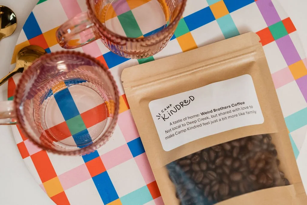
In our design process with Emilie, we established that mushrooms would be a reoccurring illustration assigned to every Camp Collection individual property logo. The mushroom is a design motif travelers will find in every property, whether featured in artwork or like an easter egg (i.e. found in subtle ways). The varietal chosen for each logo would be reflective of the property personality itself. So in the case of Camp Kindred, the classic toadstool mushroom felt just right, and especially marketable for attracting families, the primary traveling group served here.
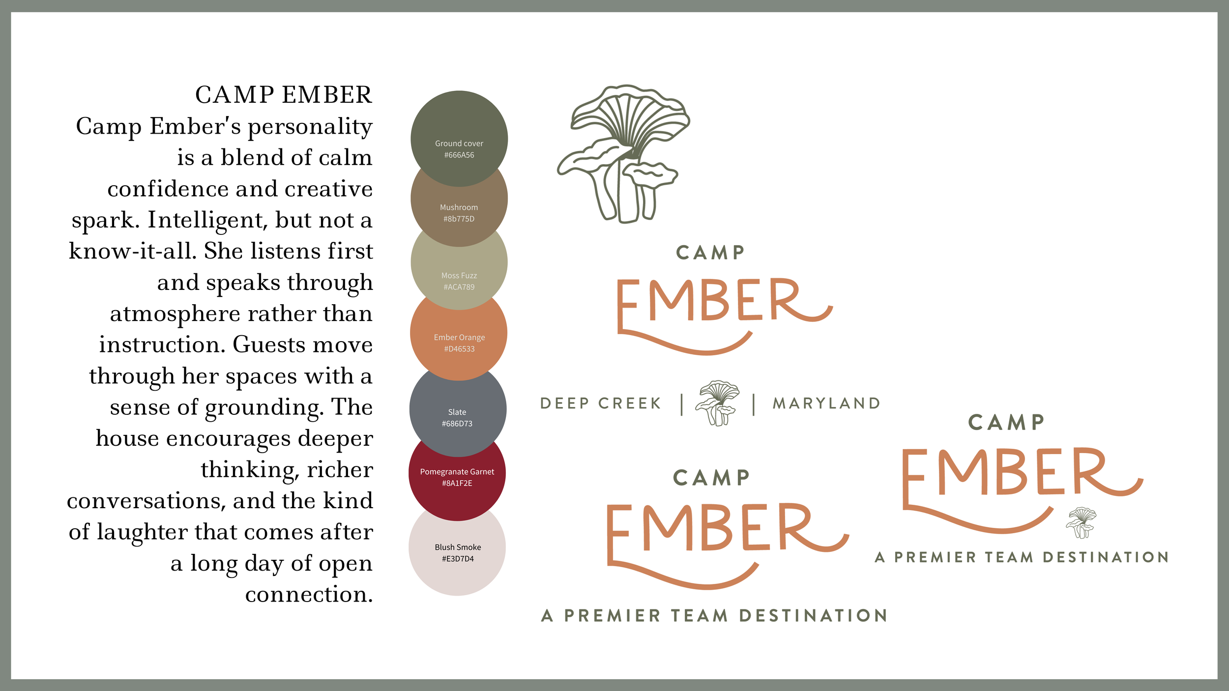
The chosen mushroom varietal for Camp Ember is the chanterelle—and specifically illustrated as a grouping, signifying Camp Ember’s greatest selling point: a premier team destination. It’s elegant and slightly more elevated, considering Camp Ember is the “big sister” next door to Camp Kindred. You’ll see we created two versions of this logo with varied text below. Because this property is designed as a destination spot, it’s important for host to overtly market Camp Ember using both PLACE and PURPOSE as an instant point of reference for viewers.
2) BUILD A COHESIVE IDENTITY, NOT JUST A SET OF LOGOS
DAWN: Since The Camp Collection acts as an umbrella brand across two properties (with third one on the way), how did you approach designing a logo system that feels unified, but not repetitive?
EMILIE: I loved this process because I was able to find both the visual voice of the broader umbrella brand, and also find what made each property unique. What could I add to make that property stand out, yet fit within the umbrella. And I really liked the parameters that that process gave. I wasn’t starting from scratch each time, but rather just finding the element that would make that property stand out.
DAWN: What are the visual or conceptual “rules” you established to keep the identity consistent across Camp Kindred, Camp Ember, and future properties like Camp Solace?
EMILIE: As I was working through the different property logos (and The Camp Collection logo), what I wanted to keep consistent was style. I didn’t want the various logos to feel disjointed, so I tried to keep a thread with a similar balance of the hand drawn/illustrated and the modern. While each logo has its own identity, I love being able to see the thread through them all.

3) DESIGN LOGOS TO LIVE BEYOND THE SCREEN
DAWN: One of the most unique moments in this project was Camp Ember’s logo being translated into a mosaic tile entryway installation (set for install this summer). How do you think about designing logos that don’t just live digitally, but become part of physical space and guest experience? Are there changes in your design thinking when a logo can be expected to exist in architecture, not just branding assets?
EMILIE: My design style tends to stay in the minimal/modern lane. Which I love for many reasons, but especially here. Translating logos into physical products (mosaic tiles, metal signage, et cetera) is a fairly seamless process. And seeing the logos come to life in this way is just so fun!
Knowing that the logo will be used in a variety of different ways keeps me mindful of ways that details could get lost. Keeping things clean and without a lot of small details allows that transfer to be easier.
4) TRANSLATE EMOTION INTO VISUAL IDENTITY
DAWN: Within our Brand Story Guides, you had brand filters specific to each property. How do you translate emotional intent (like Camp Ember’s “REFINED WARMTH,” “MINDFUL PLAY,” or “CAMARADERIE”) into a visual mark?
EMILIE: Translating emotional intent takes intention and it’s something that I keep in my mind as I am putting various design sketches together. Also color really plays a big role for me here. Adding in colors that align with an emotion can really shift a design feel.
DAWN: What makes a logo feel like it belongs to a place rather than just a brand?
EMILIE: The details. The small illustrations that connect to this place specifically. And I loved seeing that play out in a larger brand umbrella. Each property logo had its own specific detail that communicated the heart and values behind that space.
5) CREATE CONSISTENCY WITHOUT SACRIFICING EVOLUTION
DAWN: As Camp Solace enters the Brand Story Guide phase, how does having an established system like The Camp Collection inform your creative approach?
EMILIE: Having the Camp Collection established allows me to ask more specific questions about Solace. Since I know the heart behind The Camp Collection and who the client is, it allows me to sink more deeply into the heart behind Solace.
DAWN: Where do you allow for evolution versus consistency within the brand family?
EMILIE: Oooh, I love this question! One way I like to do is create a lot of different styles in the initial logo sketches. Some that might not align with the brand family, but gives us something to push against which gives me more content to narrow down to the logo that fits both specificity and continuity.
NEXT TIME YOU FIND YOURSELF IN FRONT OF THE WHITEBOARD
I believe the best hospitality brands are built holistically—not from disconnected visuals or design decisions driven by trends, but from a deep understanding of the emotional experience you want guests to step into.
That’s the work we do at The Olive Jar.
Because when the foundation is strong, the logo becomes more than branding.
It becomes part of the story guests remember.
If you’re building a vacation rental brand and want the full picture—not just isolated design assets—we’d love to help you shape the story first.
Start by taking our hosting quiz to explore how you’re performing as an STR storyteller.
By the way, in the next blog entry, I’m sharing another angle of our Brand Story Guide process through The Sideline Club—where the logo pre-existed upon The Olive Jar stepping in. This will be a great case study of how the logo became a powerful narrative anchor for our experiential design work that followed.
It’s proof that story-driven branding can begin at any stage of an STR’s evolution.
Image credits: The Olive Jar, Anchor Pictures
For more of Emilie’s work, visit LiefDesign